Showing posts with label illustration. Show all posts

Thursday, February 16, 2012

Business as Usual

Faniel:
Well my winter semester is over, so I have some work I can show, but I'll also talk a bit about some artists whose work I've seen around, cause I've definitely not done enough of that lately.

I may have mentioned being in a class called Monster, it's a class in the Painting major (and actually I took it to learn painting,) but basically all of the assignments were open to any material, except a sound project and this movie: "Oh Deer"

The antlers in the movie were the piece that i had made the previous week for the prompt "metamorphosis." I'm pretty happy with how both turned out, and thankful to have had good partners in making the movie.

And for proper art.
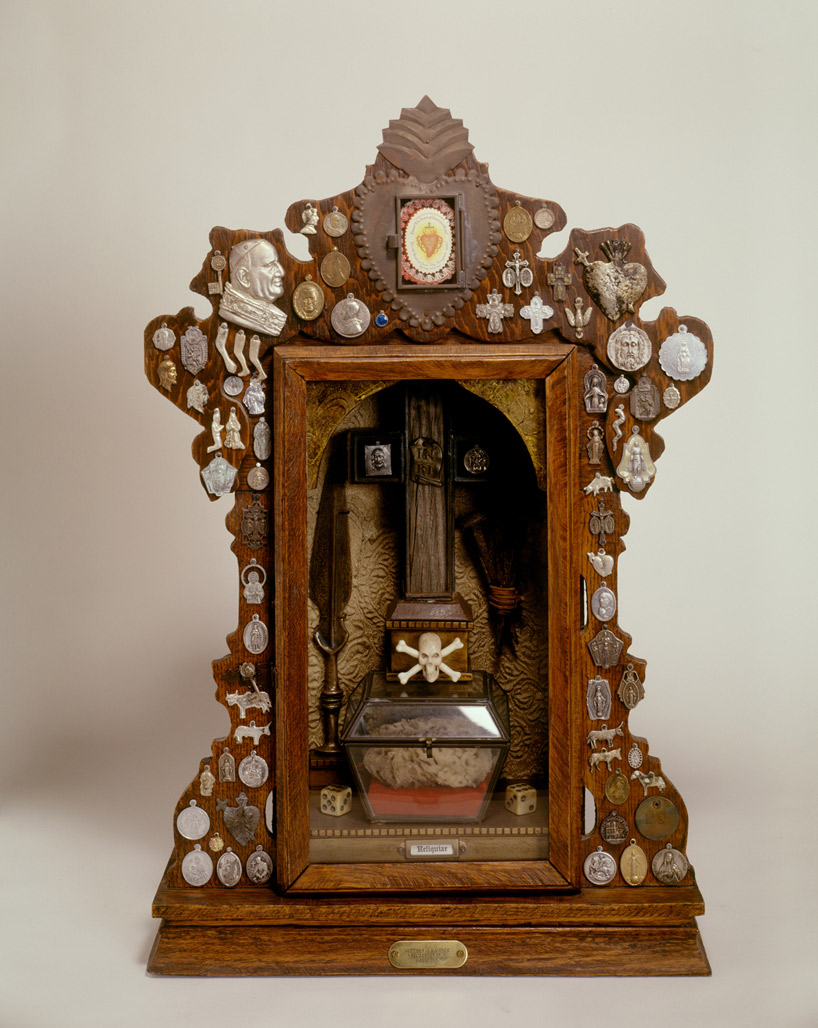
Here is work by Jeffery Vallance. These are from a series of little reliquaries that kind of relate the personal sentimentality of some artifacts to the sacredness of pieces of holy figues or whatever. I think stuff like this is clever and sort of comforting in a non-superficial way.
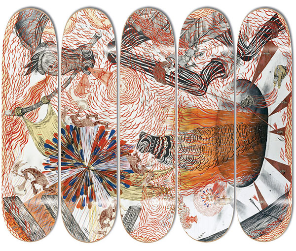
I'm not feeling talkative enough to write a really wordy post, so I will leave you with some rad illustrations by Andrew Schoultz, who I think Alec might have introduced me to. Very "cool" style of illustration, seems very marketable.
-Daniel <3

Sunday, April 10, 2011

Mister Hipp


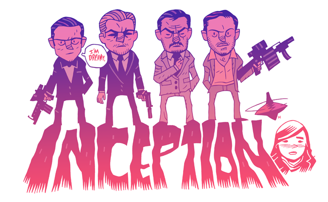
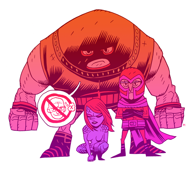
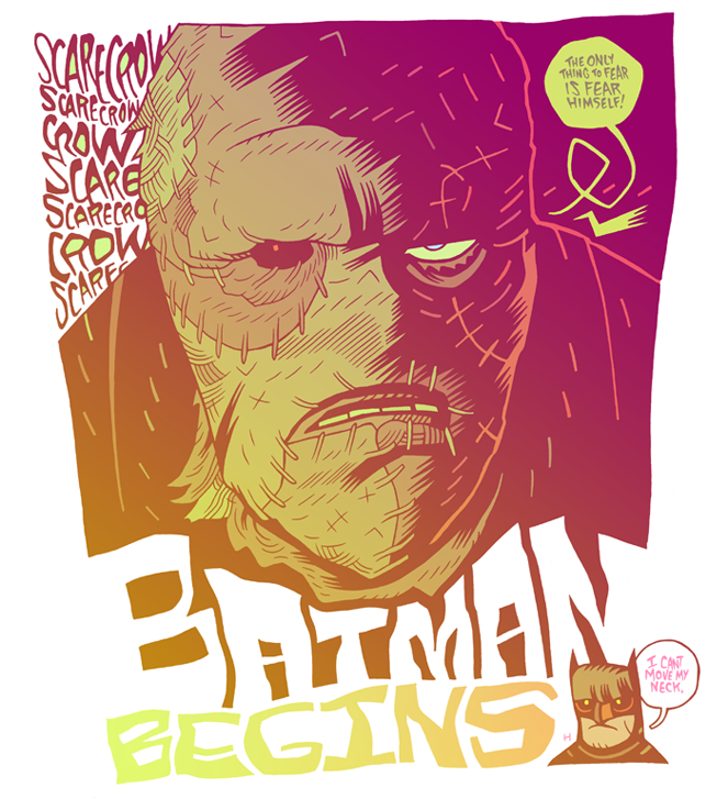
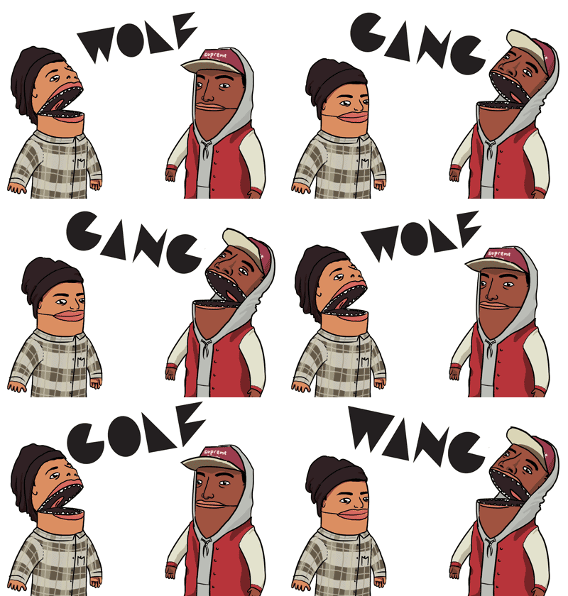
Yo Hey I know how much you're craving a normal post, so I've no choice but to oblige. Today I'll show you some work by cartoonist Dan Hipp (a.k.a. MisterHipp.) Dan has illustrated a number of graphic novels, including the solo project Gyakushu!, and Amazing Joy Buzzards. Outside of his comic work, he makes a lot of nerdy pop-culture illustrations. His illustrations are generally done in this style: not-too-detailed but very expressive characters with exaggerated proportions and gestures, and dreamy gradient fills. His drawings are simple and cute, with inside jokes for people familiar with the fictions he draws upon, but I dont think appreciation really relies on recognition of the source material necessarily. The work on his site isn't terribly sophisticated and pretty much speaks for itself so there's not much else to say about it. He's definitely a good illustrator and a pretty strong graphic designer, and if you're any kind of culture nerd, you should be able to find some enjoyment in his work. His blog is a pretty comprehensive archive of his illustrations, so i suggest you czech it out. Link
Thanks for reading,
Daniel

Thursday, March 24, 2011

Current Work


Turns out I haven't just been sitting on my ass for the last month. Here's some stuff I've made recently.


Love,
Daniel

Tuesday, December 14, 2010

Concept Art

First things first: Go down and look at Alec's last post if you haven't.

Don't tell anyone but I am secretly a nerd. As such, I'm a real sucker for sci-fi and fantasy culture. I think something really tragic and beautiful about so many games, movies and shows is the concept art. Tragic because it's rare that the final product ever matches the feel of the concept art, and beautiful because, well:

Yeah, C3PO used to be very Metropolis. Star Wars is one of rather few movies that reliably lived up to its concept art. Often, it occurs that when concept art is held up next to the finished product, they seem like two independent IPs. This isn't really a bad thing, and can make up for some interesting contrasts between the concept and the way it is carried out. I think concept art might be what really sparked my interest in illustration, and it's definitely the kind of thing that I can see myself doing.
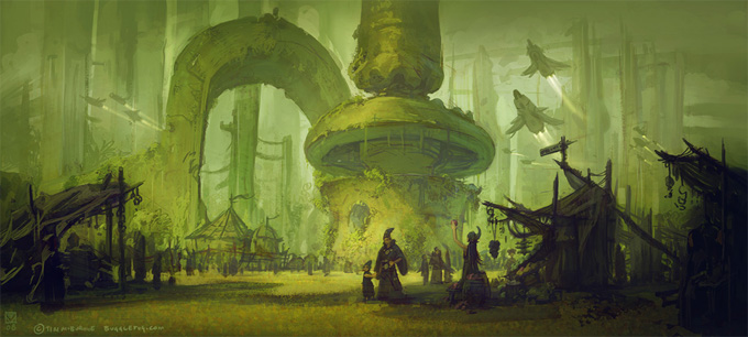
What really constitutes concept art is kind of nebulous but I've read it defined as illustration with the objective of representing and idea, design, or mood for another creative work, be it a video game, movie, or comic book. For a little reference, I'll throw some stuff up that calls itself concept art:
This is a digital painting by Tim McBurnie. Scenes this involved are usually limited to the pages of comics and webcomics because of the relative cheapness to produce compared to the cost of making a movie or game. At any rate, I am into exploring fictional worlds and I think concept art generally makes them seem a lot more concrete and nearer to existent, whether or not the art is made as part of a bigger production or in relation to an existing work. See more of Tim's work here: http://www.timmcburnie.com/

This is the work of Matt Gaser, and it pains me to post only one image of his, but I'll post the link to his portfolio in a sec. Something I am noticing as I write this is it seems like many of the illustrators that use digital painting assume a sometimes of generic style full of colorful, glowy luminosity when painting big scenes. It might have something to do with the wide appeal of the style. It doesn't really bother me, because there is enough variety between scenes and in they way that certain elements are handled that I don't really get tired of looking at concept art. Mostly, it just makes me really want to get a Cintiq. Matt Gaser Home

A blog that I came across while looking for artists was Muddy Colors. Muddy Colors is "An Illustration Collective" and they have a lot of guest posts by working illustrators. I think it's a really good resource of information and expect to probably visit it more in the future. I hope you liked this post and Alec and I promise to post more regularly soon.

Love,
Daniel

Sunday, October 24, 2010

Scott C.


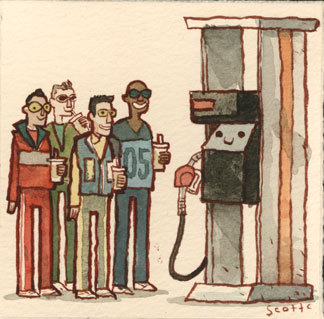
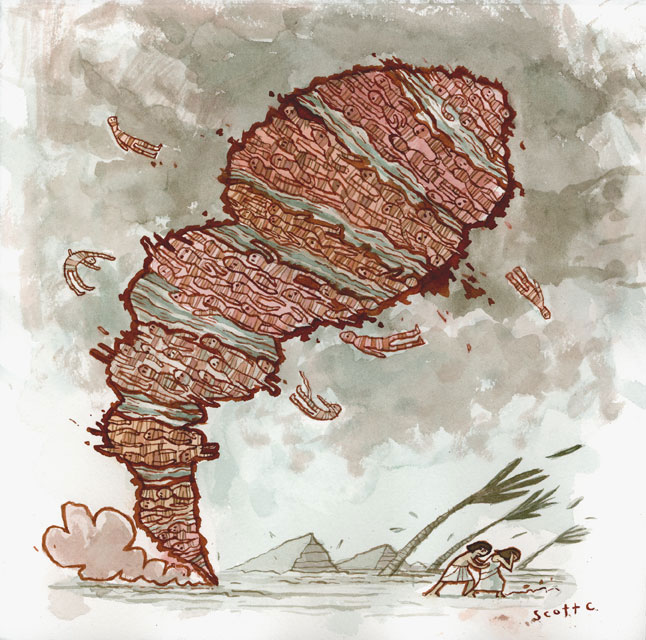
Pardon the spacing, but I wanted this picture to be the first thing you saw. It's the work of Scott C., and like almost all of his work, it draws heavily upon pop culture. Exhibit B: his tumblr- Great Showdowns. Great indeed. The site is a series of illustrations of adversaries from movies, more or less. Some are really nutty:
“Have you ever wondered if there was more to life, other than being really, really, ridiculously good looking?”

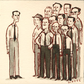
Others are a little more serious:
“Well, there were eleven votes for guilty. It’s not easy to raise my hand and send a boy off to die without talking about it first.”

Something all of the showdowns share is a remarkable style that seems to shine optimism upon the often dark movies they illustrate. Man, looking back through the older ones, I just want to post all of them here because they are making me remember movies as being much better than they really were. I am also a big fan of watercolors, so Scott is like my man. You can see a lot more of his work on his blog, and his flickr, and there is absolutely no reason for you not to click at least one of the links I've posted.

-Daniel

Thursday, October 21, 2010

Cop-out

No, not Cop-out like the hit movie starring Tracy Morgan and his sidekick Bruce Willis. Unfortunately, this post is the kind of cop-out where I just post some of my recent art. I promise to have a real post in a day or two, but things are getting crazy.Sorrys, thanks,

-Daniel

Sunday, September 19, 2010

Olivier Kugler

Heya,

So, the school year's started, and hopefully it will bring some kind of regularity with it. I've got my plate full with arts and whatnot, so maybe look forward to seeing some of my better arts, unless you're not into that kind of stuff, in which case, you can just skip those posts- whatever works. In the meantime, I somehow found Olivier Kugler.


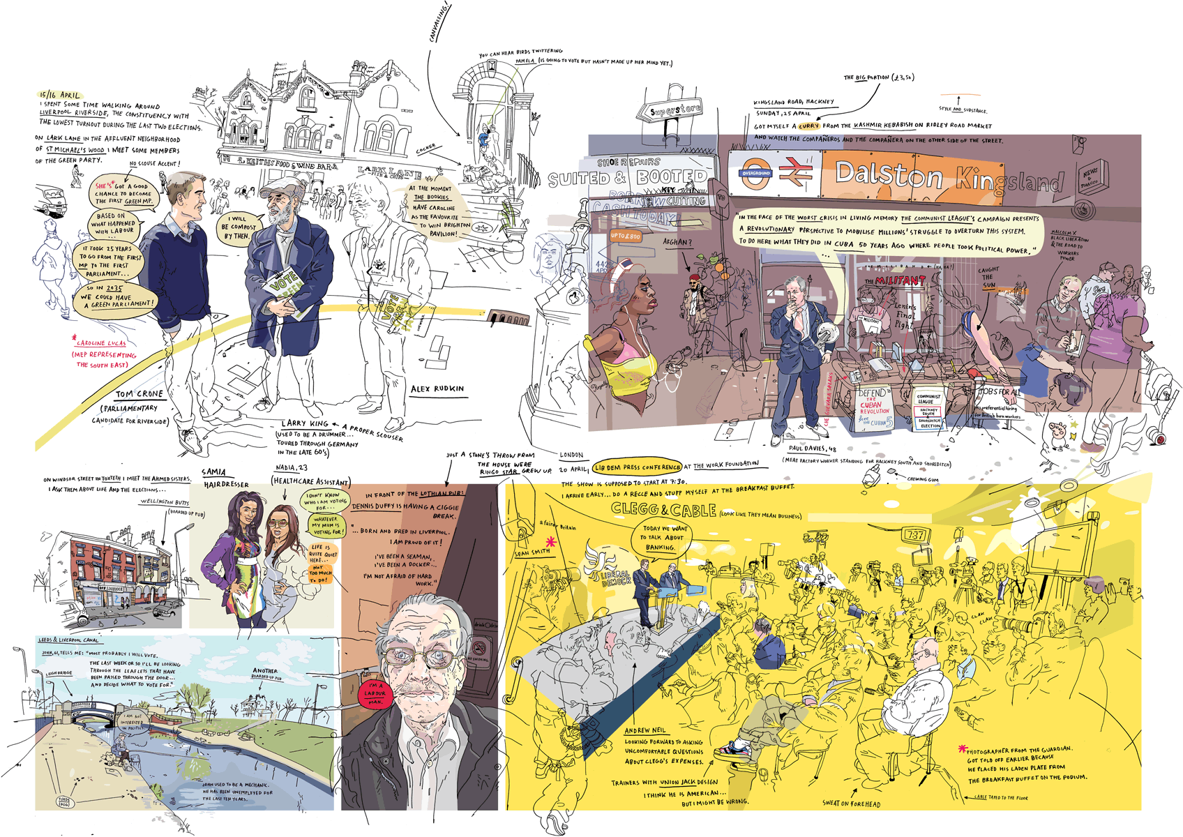
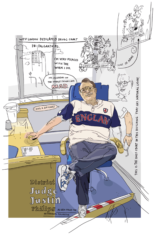
As he states on his site, Olivier loves to draw on location or from his own reference photos, and he does it very well. Most of his illustrations are simple portraits or very photographically framed scenes(if that makes sense). I really like his portraits; I think the best way I could describe them is as unmistakable approximations(if that also makes any sense). To expand on that, I guess you could say they don't precisely represent the people they depict, but the drawings are still pretty unquestionably them.

This picture is bigger than I'd like to include, but I like it too much to leave it out, so if you haven't clicked it yet, please do yourself the favor of clicking it. I find it really striking for the amount of detail and the annotations that really insert you into the scene. I also love the way the scenes bleed into each other, and how certain areas are a lot more developed than others;I think that in on-location drawing, the selective development of parts of the scene can be especially effective at drawing attention to certain subjects, and conveying a sense of motion or even stillness, from the apparent passage of time.

Okay, transparency issues are making this next pic. come out strangely, but I think it's worth the click.
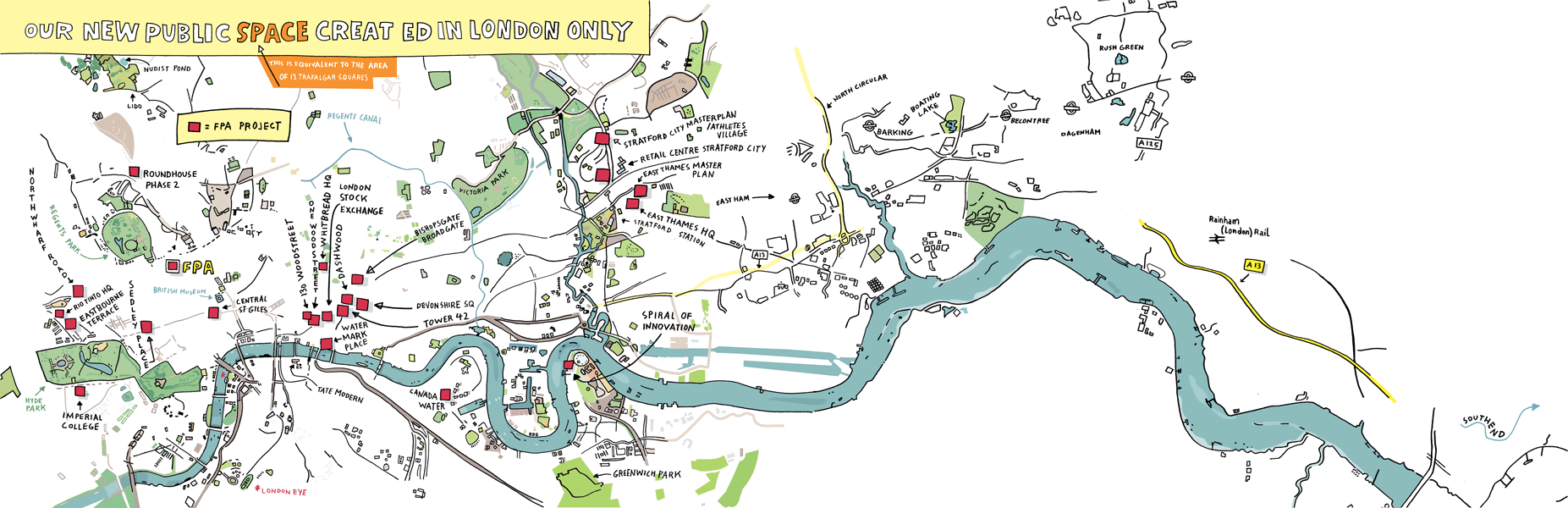
Also, a pretty gnarly map:


Definitely check out this set of his illustrations if you've got some time to spare! LINK

-Daniel

Saturday, September 11, 2010

Original Content

At last! At last your breathless anticipation has born fruition. Behold!Was I joking? Maybe a little, but I am still pretty proud of it. I did it at Carnegie Mellon and kind of lack the facilities to put on the finishing touches -As you can see, it is pretty big. Here's some more art from the summer:
For the record, this guy was a pretty lousy model; he kept dozing off- what an amateur!

We also did ceramics; I made three sets of hands based on the hands in famous paintings. I got the positioning a little off of this, but I think it gets the point across. I plan to Photoshop it up a bit.
Sketchbook stuff:
Enjoy!

-Daniel

Sunday, August 8, 2010

Home

Carnegie Mellon Pre-College Art Program: maybe the best month and a half ever. That being said, I'm spent, but I'm excited to get back in the groove of posting. I think after this post, I'll show you the work of some of my professors, and maybe my own work too. For now, I'll throw ya another Newgrounds artist.
Hah. That's Famiry's work. He mostly does design and illustration and his illustrations usually have something sexual or phallic in them. I really appreciate his attention to detail, and his experimentation with different styles.
It's mostly pretty dark but with a sense of humor that demonstrates a lightheartedness about the subjects. So, I'm barely conscious but I figured this post couldn't really wait. Whateva, enjoy this last one.
Take it easy, you guys.
Daniel

Tuesday, May 25, 2010

David Galletly

Sorry I'm late, let's talk art! Alec's friend brought this guy to my attention and for that, I am very thankful. Pretty neat, right? Well, according to his site/portfolio, "David Galletly is a freelance artist, illustrator and graphic designer living and working in Stirling, Scotland. He graduated with a degree in graphic design in 2004. David has exhibited throughout the UK, Europe and the USA." From that description, David really seems to be living the kind of life I am gravitating towards, so to see his stuff is really cool on a personal level, for me. That being said, I'm certain his work can be appreciated by most anyone. When I first saw the work on his site, I could not rid myself of mental images of the work of Marc Johns and Nicholas Di Genova. If you're familiar with their work, I'm sure you'd agree that there are some stylistic similarities, though they are still distinctly different.
I think this picture pretty well epitomizes the combination of Marc Johns' quiet simplicity and Di Genova's complex juxtapositions of simple patterns. A notable difference is the plausibility of the subjects that Galletly features, compared to Johns and Di Genova. That might sound strange, but most of his pictures are of pretty normal stuff, whereas you'd find antlered men and bird guns with the other two.This is not to his discredit by any means, because he demonstrates a pretty clear capacity for drawing strange things. Evidence:
Bam. This picture brings me to something I really like about his illustrations. Gallenty has managed to incorporate some pretty playful colors that you don't often see done in a tasteful way. Really, it's just red and blue, but in a very pleasant combination that serve to clarify his purpose - notice the distinct areas of red and blue in the picture above. I can't really say a whole lot about the deeper side to his work because for the life of me, I can't see it, myself. It might have something to do with the relatively small number of pieces on his site, and if not, that's art, right? Sometimes you just don't get it.

I hope you like what you've seen, and maybe you can make some more sense of it than I could.
Enjoy,

-Daniel

Friday, April 16, 2010

GHOSTSHRIMP

I know you read my Adventure Time article, so I'm sure you'll recall that I mentioned GhostShrimp. I didn't give much of an explanation of what GhostShrimp is because I didn't really understand and while it's still a bit hazy, I'll do my best. The information on the website was rather confusing to me, and I am under the impression that I may be about to misinform you direly, but if I've put the pieces of the GhostShrimp puzzle together correctly, this could very well be a highly informative post.

GhostShrimp is "probably the world's first solar powered illustration company." The "company" seems to be more of a commune located at Camp Ghostwood on Mystery Mountain, peopled by artists and friends of the founder Dan Bandit (whom I suspect may be Dan James). There's a pretty interesting history section on the site that gives a vague idea of how the camp came to be. Some choice excerpts from their Secret Mission:

"WE EXIST FOR TWO REASONS OF COMPLETELY EQUAL IMPORTANANCE. ONE: WE ARE INSPIRED BY OTHERS AND WE INSPIRE OTHERS. TWO: WE PASS OUR TIME DOING THE COOLEST THINGS WE CAN IMAGINE."
"CAMP GHOSTWOOD IS A SMALL EXPERIMENT IN UNCIVILIZATION AND SELF RELIANCE. IT IS A FORTRESS AGAINST ARBITRARILY ESTABLISHED WAYS OF LIVING. IT IS A PLAYGROUND FOR ALL THAT IS INTIMATE AND PERSONAL."

The whole statement is pretty interesting and a little cryptic, but worth the reading, as are most things on the site. Something I noticed was where the news section of the site mentions summer internships at Camp Ghostwood, which sounds like maybe the coolest thing I've ever heard of, and if you're as into this kind of stuff as I am, it would be worth your time to drop them a line, or an e-line.
As far as I can tell, the work on the site and what they're producing for Adventure Time is primarily the work of Dan James, a freelance illustrator who's done work for The New York Times, The Marvelous Misadventures of Flapjack, and various bands and musicians. James has released two graphic novels: Mosquito and The Octopi & The Ocean - about which there is a laughful interview located here.


I'm pretty in love with his style. He recycles a few general characters in all of his illustrations, and the generic nature of the individual characters emphasizes their actions and surroundings. And surroundings are where Ghostshrimp illustrations really shine; the chaotic narrative pieces split your focus and force you to examine each element independently and appreciate the fine details of the picture. Conversely, the large amount of detail results in some pieces that would probably be a bit too busy for some people, especially on the limited scale of a computer screen -most are made to be printed. More than redemptive, in my opinion, is his color choice. I'm a sucker for pastels and the light contrasts in his works make the busiest of them much easier to look and disassemble. I hope you are as intrigued and captivated by Ghostshrimp as I am, and both they and I hope that you are inspired in some way.


Thanks for reading.

-Daniel

Saturday, March 6, 2010

Matt Marblo


If you like cool things, this guy's your guy. Matt Marblo/ Wolfentir/ Wolfenheim is a student and "prentice sorcerer" at the School of Visual Arts in New York. Here's a cool thing that he made:
Matt's illustrations- and lately his animations- are an assortment of very cartoony, often surreal characters. His style is unique and his characters are cute, and mostly original, though sometimes influenced by television or various nerdy sources. I'm a big fan of his textures, namely the noticeable ones he creates with lines, but also the subtle ones that he creates digitally. A great example of his use of textures and color is:
The first work of his that I saw prompted me to ask him about how he made it. Like the lovely man he probably is, he was kind enough to respond in simple terms.

" i draw in flash overtop a regular drawing i scanned in, then ill add color n such and for the shop i brought it into photoshop and opened a texture i had downloaded, put it on a new layer and set it to overlay and ajusted the opacity settings until it looked good."

What a guy! And I think I will probably be doing something like this for my own illustrations in the future, now that I have the resources to do it. Anyhoozles, as his animation skills develop, Matt is definitely somebody to keep an eye on and you can do just that by clicking here. He's got some stuff for sale for pretty cheap, so totally buy it or something.

Oh! and I tribute him, not Adventure Time for my use of bendy arms.

-Daniel